


Over the last couple of years, we’ve shared how Glean approaches focus management and keyboard shortcuts, as well as screen readers, color, and responsive design. Those posts covered the philosophy and the technical underpinnings behind our accessibility work from an engineering perspective.
We wanted to now follow up with a design perspective—showing how these changes mark a shift in how we build products. Instead of treating accessibility as a set of one‑off fixes, we’re baking it directly into our tokens, components, and patterns. That way, accessibility becomes the default for every new feature.
With that, we’re excited to share two big milestones in our journey:
- We’ve revamped our design system into a more accessible foundation powered by Base UI, which brings better screen reader and keyboard accessibility out of the box. Many thanks to the Base UI team and congrats on the 1.0 launch! 🎉
- We’ve completed our VPAT (Voluntary Product Accessibility Template), improving transparency during evaluations. Customers can formally review how Glean aligns with their accessibility standards.
A more accessible and standardized design system
In our previous posts, we talked about layering accessibility into product design, including getting keyboard focus right, using semantic HTML, supporting screen readers, and standardizing colors and typography. Underneath all of that is a crucial piece of infrastructure: our design system.
Since then, we’ve done a significant upgrade to that foundation. The goal was simple: make the most common building blocks of Glean, like controls, buttons and inputs, accessible by default, so every new feature inherits better behavior without requiring extra work.
Standardizing components, not just pages
As part of the migration, we audited every component in our library, including buttons, inputs, selects, tooltips, popovers, and more. Over time, we’d been a bit too lenient with component customization. It was easy to override styles or behaviors at the callsite, which led to lots of one‑off variations.
We used the migration as a chance to reset the baseline:
- Each component now has a small, opinionated API: a focused set of props that capture the meaningful, semantic differences (for example, variant, size, or whether something is destructive), rather than every possible styling knob.
- Callers can still pass a style, but it’s limited to layout‑centric tweaks (like margin) rather than visual styling like colors or typography. This keeps individual screens flexible without letting them drift away from the system.
- In Figma, these same components are represented with a matching set of variants and states, so designers and engineers are truly working from the same component, not just similar ones.
In practice, that means a component like Input behaves the same way everywhere—same label pattern, same error state, same focus treatment—no matter which team uses it. That consistency reduces cognitive load for users, prevents subtle accessibility regressions, and keeps teams from re‑implementing slightly different patterns that drift out of alignment over time.
Standardizing tokens, not ad‑hoc CSS
We also standardized the design tokens that sit underneath those components.
Historically, it was easy to drop in ad‑hoc CSS like margin: {number}px or a hex color directly into a component. Over hundreds of components, those small one‑offs add up. Layouts are harder to change, visual consistency drifts, and checking for contrast or spacing issues becomes more manual.
Today, spacing, color, and typography all go through a tokenized system. Since we already use vanilla‑extract, we layered sprinkles on top to semi‑enforce those tokens in code—similar in spirit to how Tailwind encourages utility‑first, token‑driven styling.
- Need spacing? You use a spacing token, not a raw pixel value.
- Need a text or background color? You choose from the semantic color tokens that are already vetted for contrast.
- Need to adjust layout? You reach for predictable utilities instead of inventing a new pattern.
This alignment between components + tokens does two things for accessibility:
- It makes it much harder to accidentally ship something with poor contrast or tiny hit‑areas, because the defaults are already compliant and consistent.
- It makes it easier to change things centrally—for example, improving a focus ring or text contrast in one place and having that propagate across the product.
For examples, we used to have multiple ad-hoc versions of the Input component:
// style can accept any properties
<Input id=”A” style={{height: 40px, border-color: black, marginLeft: 8px}}>

// Input B has very non-standardized height and margin
<Input id=”B” style={{height: 37px, border-color: black, marginLeft: 7px}}>
<Input id=”C” style={{height: 36px, border-color: red, marginRight: 8px}}>
After the migration, this became:
// style now only accepts layout-centric properties like margin,
//position, etc…

// height is converted to a semantic size prop, with standardized
//36/40px or equivalent rem under the hood

// border-color is converted to a semantic borderVariant prop
//that maps to respective color value under the hood

<Input id=”A” size="sm" borderVariant="default"
style={{marginLeft: 8px}}>

// Update input B to use the nearest standardized height and margin
<Input id=”B” size="sm borderVariant=”default”

style={{marginLeft: 8px}}> <Input id=”C” size="lg" borderVariant="error"
style={{marginRight: 8px}}>
Better screen reader support built in
Previously, getting a component “just right” for screen readers could require a lot of custom work: picking the right HTML elements, wiring up ARIA attributes, and testing in multiple assistive technologies.
Migrating to Base UI gave us a more solid foundation here, and it also unlocked a bunch of screen‑reader wins that now come “for free” with our components:
- Lower‑level interactive components expose the right state and roles. Controls like switches, checkboxes, and radios now automatically surface the appropriate role along with state attributes like aria-label and aria-checked, so assistive technologies can correctly announce what the control is and whether it’s on or off. On the design side, we’ve standardized these controls with clear label, helper text, and error patterns, so teams don’t have to invent new visual treatments or wording for each use case.
- Popup‑based components advertise their relationship correctly. Components that open a popup—like select menus, and autocomplete—now manage attributes such as aria-haspopup and aria-expanded on the trigger, and connect aria-controls so screen readers can tell which popup is being opened.
- Listbox‑style widgets keep screen readers in sync with keyboard navigation. For list‑based components (like menus and selects), keyboard focus and selection are reflected via the correct roles and selection attributes, so screen readers can announce which option is currently highlighted or selected as you move through the list.
- Overlays describe themselves as dialogs. Modals, popovers, and drawers expose the appropriate role="dialog" (or related roles where appropriate) and carry a label that describes their purpose, making it clearer when a new “layer” has appeared and what it’s for.
- Important messages are announced via toasts, not hand‑rolled hacks. We now route important status updates through a toast system that uses aria-live under the hood, rather than ad‑hoc patterns. This makes it much more reliable for screen reader users to hear confirmations, errors, and other key events.
- Fewer nested interactive elements. Our components now render a single, correctly typed interactive element (for example, a button or link), instead of nesting an anchor inside a button (or vice versa) just to get the right styling. This is both cleaner for screen readers and less confusing to navigate.
- Tooltips behave better with assistive tech. Tooltips are notoriously tricky for accessibility due to because they often rely on hover-only behavior, are difficult to expose reliably to screen readers, and require careful keyboard focus management. In Glean, they now show up not just on mouse hover, but also when an element receives keyboard focus—so keyboard and screen reader users get the same hints as mouse users. We also make sure the text inside each tooltip is concise and helpful for screen readers, and avoid repeating information that’s already announced (for example, when an element already has its own accessible label).
In practice, this means that when you use Glean with a screen reader, more of the UI “just works” out of the box: the right roles are exposed, the right relationships are wired up, and important state changes are announced without every feature team having to reinvent the same patterns.
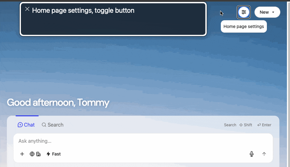
[Example: Tooltip and Menu with screenreader support out of the box]
Better keyboard support and focus management
In part one of this series, we highlighted how important keyboard navigation and focus are—not just for screen reader users, but for anyone who prefers or relies on the keyboard.
Our new design system extends that work and make those behaviors even more reliable:
- Every interactive element is keyboard‑friendly by default. Buttons, links, inputs, menus, tabs, and other widgets are all reachable via Tab/Shift+Tab and operable via the keyboard. This dramatically reduces the chance that a feature ships with an element you can see, but can’t reach without a mouse.
- Dialogs manage focus for you. Base UI dialogs, drawers, and similar overlays trap focus while they’re open, so Tab stays inside the active surface instead of wandering into the page behind it. We can also configure an initialFocus (where focus lands when the dialog opens) and rely on finalFocus behavior to restore focus back to the original trigger when the dialog closes. That makes multi‑step flows much easier to follow from a keyboard‑only perspective.
- Fewer “invisible traps.” Because all of this behavior is centralized in our components, teams don’t have to remember to set up keyboard and focus handling every time. That reduces the risk of stray elements you can tab into but not out of, or surfaces that open without a clear way to dismiss them via keyboard.
Put simply? Navigating Glean with a keyboard should now feel even more natural and reliable, because keyboard support and focus management are built into the underlying components, not bolted on feature by feature.
Compliance
Many customers, especially large enterprises, need confidence that the tools they rely on meet accessibility expectations. For software, that often requires providing a VPAT—a standardized document describing how a product supports specific accessibility criteria (like WCAG 2.2 A and AA).
We’re happy to share that Glean now has an up‑to‑date Accessibility Conformance Report (ACR), based on the latest VPAT® 2.5 format, covering WCAG 2.0, 2.1, and 2.2 at Levels A and AA.
If your team needs to review Glean’s accessibility in depth as part of your evaluation, due diligence, you can find it on our resource page.
Why this matters going forward
Accessibility is never “done,” but our design system overhaul give us a much stronger foundation:
- Every new feature we ship is more likely to be accessible from day one, because it’s built on components that already handle a lot of the heavy lifting.
- Our design system gives teams a shared, opinionated starting point—from colors and typography to complex components—so accessible choices are the default, not a separate checklist.
- As we continue to evolve Glean’s look and feel, we’re treating accessibility as a core design principle, on the same level as clarity, consistency, and brand.
- Customers can formally evaluate how Glean meets their accessibility requirements.
We’ll keep iterating on this work, adding new improvements and refining the ones we already have. If you rely on assistive technologies, keyboard navigation, or specific accessibility features and have feedback, we’d love to hear from you. Feel free to reach out to us at a11y@glean.com, or connect with your Glean representative to start the conversation.